Key takeaways
- Give every mockup one clear review question tied to the campaign brief.
- Label sample profiles and engagement as fictional presentation details.
- An approved mockup still needs a separate check of the real publishing assets and account.
A social media mockup should help someone make a decision before a post goes live. It is useful when plain copy leaves too much to the imagination: the headline may compete with the image, a caption may feel longer on a phone, or the proposed tone may look different beside a profile identity. A visual preview lets a client discuss those choices while they are still easy to change.
The preview also needs clear boundaries. Sample likes, fictional comments, and invented account details are presentation elements, not evidence of campaign performance. Label the work as a mockup and tell reviewers which parts are real, which are illustrative, and which remain undecided.
Decide what the presentation must resolve
Start with the decision, not the screenshot tool. A concept review might ask whether a campaign's central promise fits the audience. A production review might ask whether the approved words are legible. A final check might ask whether the destination link and publishing account are correct. Combining these into one vague request for feedback makes it difficult to interpret the responses.
Write a one-sentence review question above each concept. For example: “Does this opening explain why the workshop is useful to first-time managers?” That is more actionable than “Thoughts?” A reviewer can disagree with the audience promise without treating every visual detail as unfinished.
Use your campaign planning brief as the source of truth. The mockup should inherit the audience, offer, evidence, and intended next step. If those are unsettled, a polished preview can conceal a strategy problem rather than solve it.
Separate concept, copy, and production feedback
Create three feedback categories. Concept feedback concerns what the post says and who it serves. Copy feedback concerns how the message is expressed. Production feedback concerns readability, cropping, assets, links, and the final delivery format. Reviewers do not need technical vocabulary; a short explanation of each category is enough.
An illustrative client comment such as “This feels too salesy” belongs in the concept or copy discussion. Ask which promise, phrase, or visual creates that impression. “The date disappears on my phone” is a production issue with a clear fix. “Can the workshop include a different audience?” changes the brief and should not be treated as a minor image edit.
Give reviewers a space for the decision and its reason. “Approve concept B because the example matches our beginner audience” is more useful to the next collaborator than an unexplained green check. The approval workflow guide describes how to assign decisions without assuming that every person should approve every detail.
Use platform-style previews without pretending they are live posts
A platform-style frame provides visual context. It does not reproduce every device, account state, placement, or future interface change. Treat the result as a design approximation and perform a separate native preview before actual publication where the platform allows it.
For a text-led idea, the Tweet / X Screenshot Generator can show how profile details and copy sit together. For an image-led concept, the Instagram post mockup tool lets you pair a visual with a caption. Both are browser tools for fictional mockups, not a way to publish an actual post or manufacture evidence of engagement.
Keep the mockup mark visible in exports. Use sample identities that cannot reasonably be confused with a real customer or partner. If a presentation includes a proposed testimonial, use an actual approved quotation or describe the intended evidence without inventing the quotation. A label does not turn a fabricated customer claim into authentic proof.
Make a review sheet, not a gallery of disconnected pictures
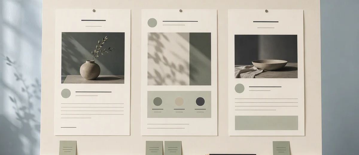
Each concept needs a small amount of context: intended audience, job of the post, placement, draft wording, source asset, and requested decision. Include a link to the working copy so that feedback does not become trapped inside an image file.
Here is an illustrative review sheet for a workshop announcement. The audience is new managers. The post's job is to explain the difference between a useful one-to-one meeting and a status update. The image shows a simple agenda example. The caption offers a downloadable worksheet. The review question asks whether the distinction is clear before the registration link appears.
Now reviewers can assess the sequence. They can ask whether the worksheet is ready, whether the agenda is accurate, and whether the destination supports the promise. Without that context, they might spend the entire review changing a background color.
Name versions clearly, such as “workshop-intro-concept-b-copy2.” Keep the approved version in one location and record what changed. A new filename alone is not a decision history. The person scheduling the post should not have to infer which of six similar images the client meant to approve.
Check the image and the message on a phone
Review the exported file at the approximate size of the intended feed. Read the first visible lines before expanding the caption. Check whether the main subject remains clear after likely crops and whether decorative elements compete with the offer.
Ask one reviewer who did not write the copy to explain what the post is about. If their explanation differs from the brief, the design may need a clearer hierarchy. This is a small comprehension check, not a statistically representative user study. Record it as qualitative feedback.
The W3C guidance for images of text explains why visual text needs careful treatment and suitable alternatives. A mockup full of embedded words can be harder to review with assistive technology. Include the post text separately in the review document and prepare an appropriate image description for publication.
The WCAG contrast explanation is also a useful reference for checking ordinary text. Its normal-text benchmark is 4.5:1, with different conditions and exceptions for large text and other cases. Do not assume that a colored background looks readable to everyone because it looks clear on your monitor.
Set a feedback deadline and a real decision owner
A review process needs someone who can resolve conflicting preferences. Identify the person responsible for the audience promise and someone responsible for factual accuracy. These can be the same person on a small team. Other reviewers should know whether they are advising or deciding.
Ask for consolidated feedback by an agreed deadline, then summarize the changes before revising. If one reviewer asks for a shorter caption and another asks for more detail, clarify the underlying need. Often the solution is a concise opening with supporting detail on the linked page, rather than choosing one preference arbitrarily.
Limit a feedback round by its purpose, not by refusing useful corrections. A factual error should still be fixed late in the process. A new creative direction may require a new brief and schedule. Making that distinction explicit protects both the quality of the work and the team's capacity.
Move from approval to publishing with a separate checklist
An approved mockup is not yet an approved live post. Before scheduling, verify the real account, original asset, final copy, accessibility text, link destination, timing, and any sponsorship disclosure. Remove illustrative engagement counts from actual campaign materials unless they are clearly part of a fictional concept that the audience is meant to recognize.
If the post includes a paid relationship or endorsement, the FTC's endorsement guidance is a useful US reference for clear disclosures and genuine statements. Other jurisdictions and platform rules may add requirements. The review sheet should identify who checks the relevant rules, rather than burying that responsibility in a general approval tick.
Finally, use your publishing checklist to transfer the approved material into the real workflow. Keep the mockup and the eventual published URL together. This makes it possible to compare the intended message with what actually appeared, without mistaking the presentation for the outcome.
Sources
Frequently asked questions
Is a social media mockup the same as a scheduled post?
No. A mockup is a visual approximation used for design review. The actual post must be prepared and checked in the publishing platform or scheduling workflow.
Can I show sample likes in a client presentation?
Only as clearly identified fictional layout details, never as evidence of results. Keep the mockup label visible and explain what remains illustrative.
What feedback should I ask for first?
Begin with audience and message decisions. After those are settled, review wording, readability, assets, and the final destination rather than inviting every type of feedback at once.
Which Caroush tools can I use for previews?
The free X screenshot, Instagram post, LinkedIn post, and text-message tools produce labeled fictional mockups. They export images and do not publish to those platforms.
About Garry
Gaurav Sapkota builds Caroush, a workspace for creating, scheduling, and publishing social content.